Hello, my name is Amish, and I’m
reimagining the world, to make user's life easier.


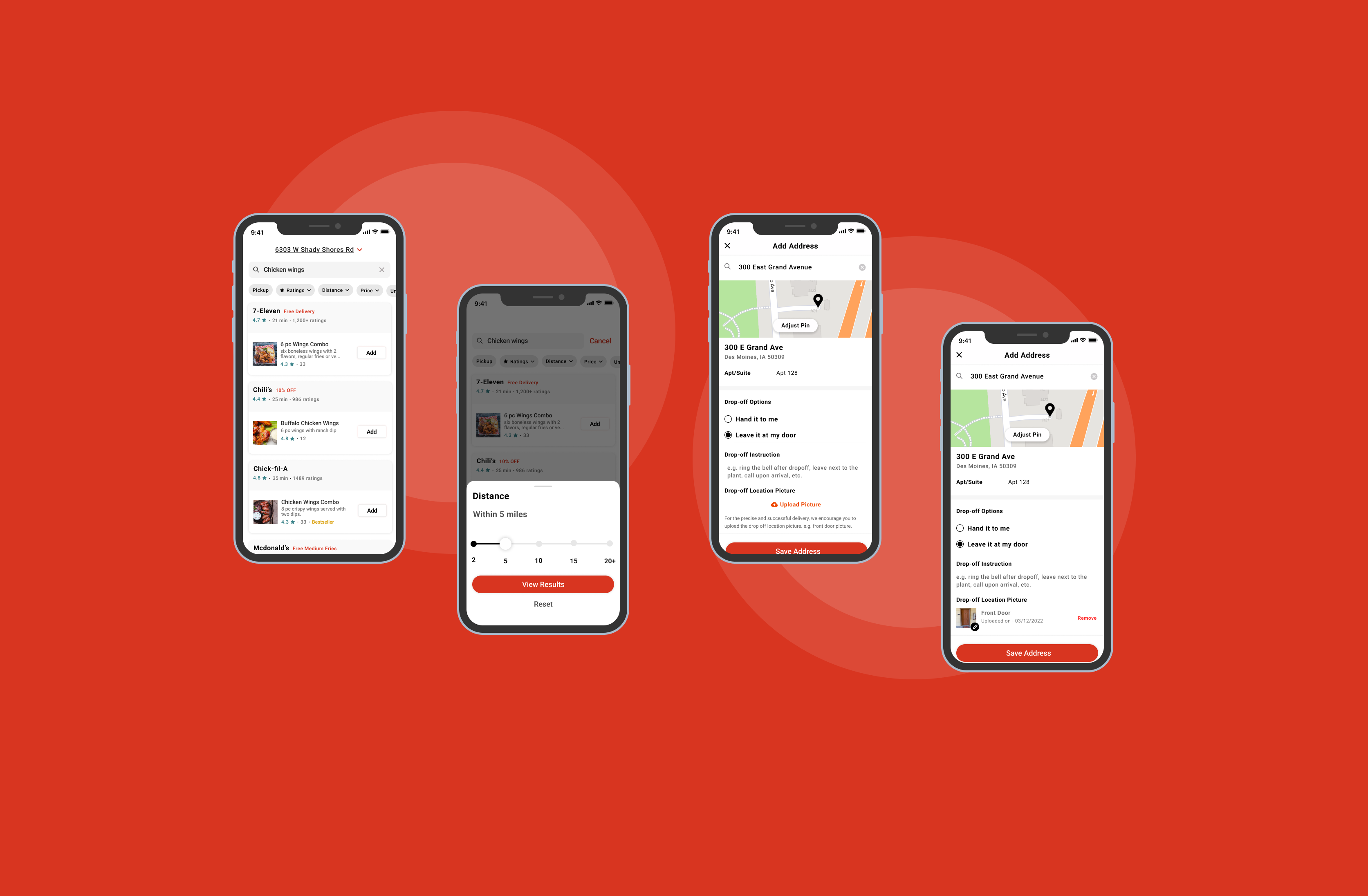
In this case study, I’ll try to identify some of the issues that users encounter when trying to order food via the popular food delivery app DoorDash. Later, I try to figure out feasible solutions.
Read on Medium→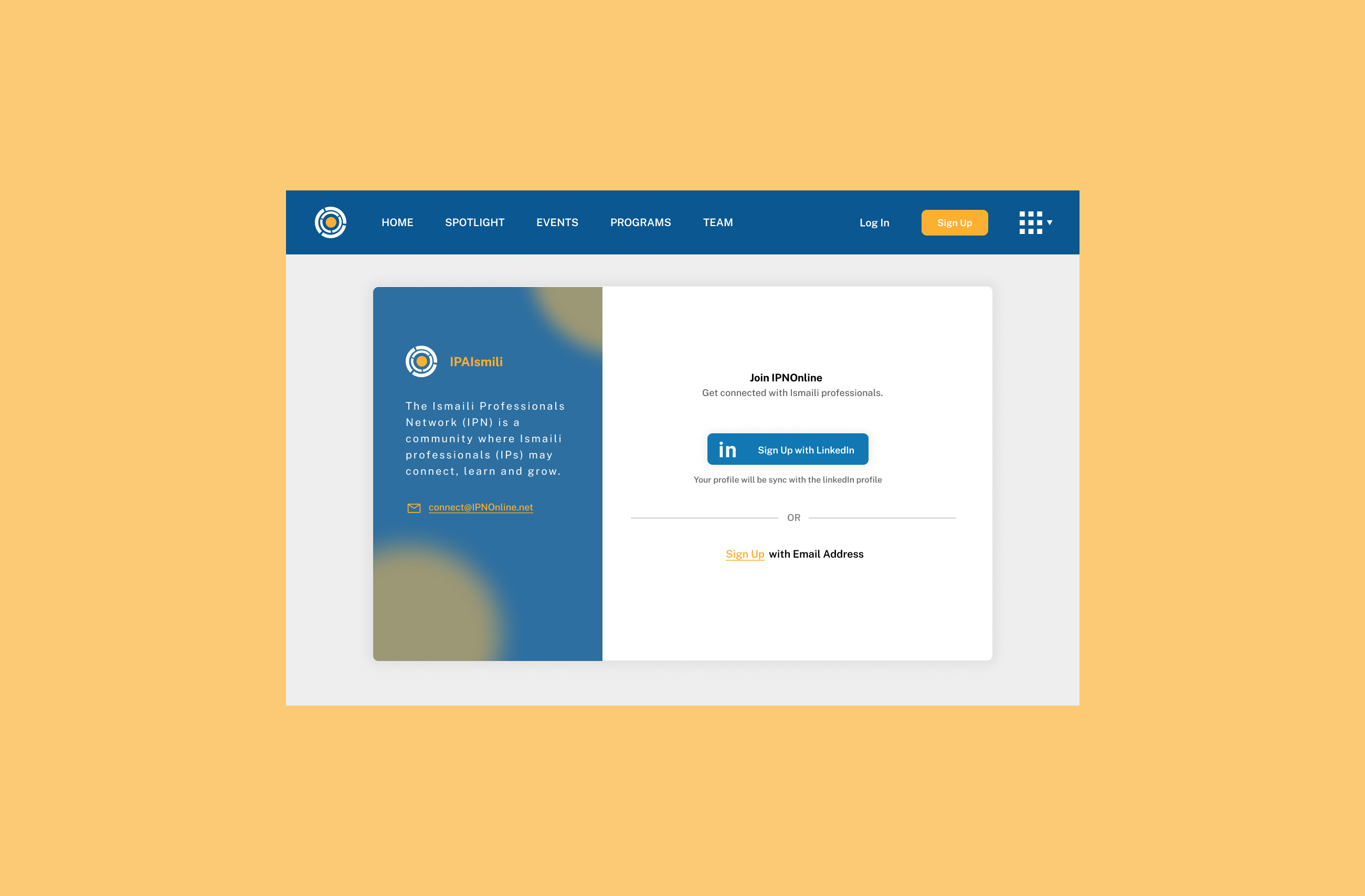
The reason behind redesigning is to make the onboarding process quick, easy, and user-friendly. So that more people can sign up and connect with other professionals.
Read on Medium→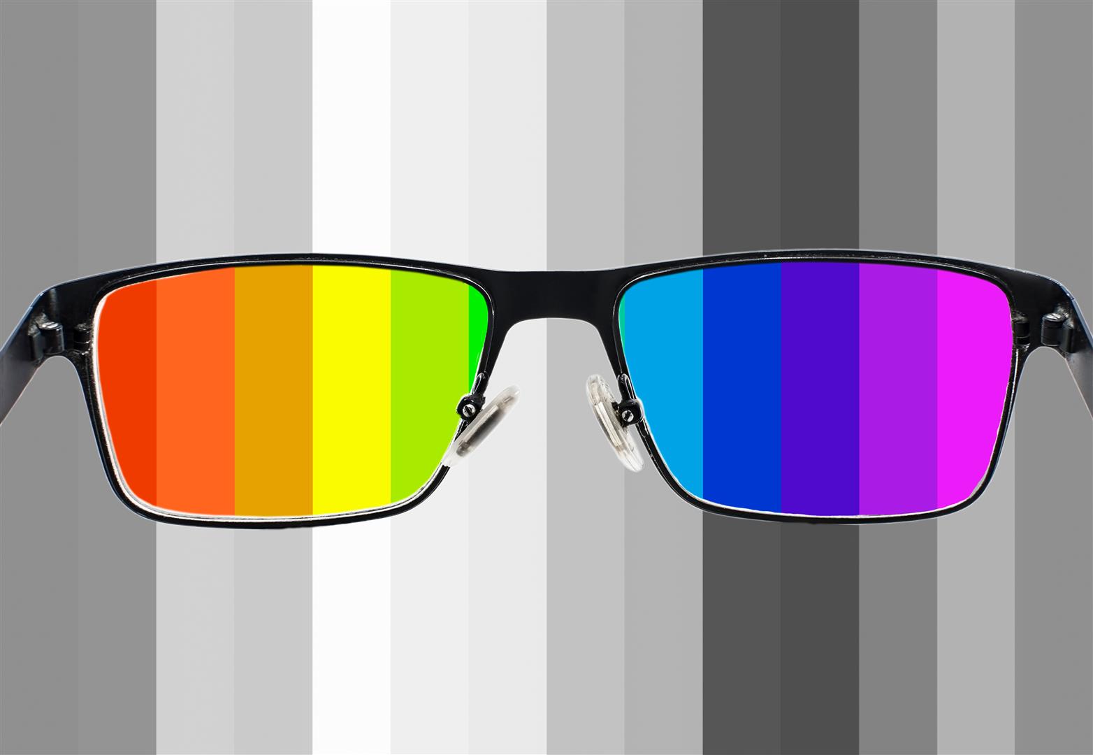
Many times we exclude some people with the disability of color blindness. So here are some ways to make design accessible to most users which include people with color blindness.
Read on Medium→